A restaurant menu operates as the primary engineering tool for food service revenue and guest interaction. It dictates operational flow, kitchen preparation times, inventory turnover, and transaction averages. When a business builds a menu around human behavior and visual processing, customer satisfaction improves alongside financial performance.
The Structural Mechanics of Visual Scanning
Humans process menus according to distinct eye-tracking movements. Understanding these patterns allows restaurants to arrange food items in paths that align with natural visual habits.
The Three-Panel Geometry
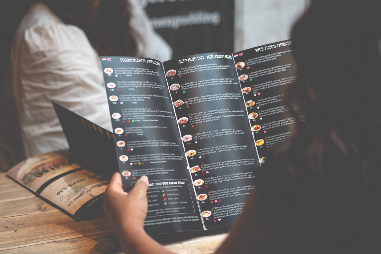
When presented with a three-panel fold, eyes move to the center panel first. From there, vision shifts to the upper right corner, travels across to the upper left, and descends to the lower sections.
[ Panel 1: Step 3 ]   [ Panel 2: Step 1 ]   [ Panel 3: Step 2 ]
[ Panel 1: Step 4 ]   [ Panel 2: Step 6 ]   [ Panel 3: Step 5 ]
Placing high-margin inventory items in positions one, two, and three guarantees visibility within the initial four seconds of guest interaction.
The Two-Panel Spread
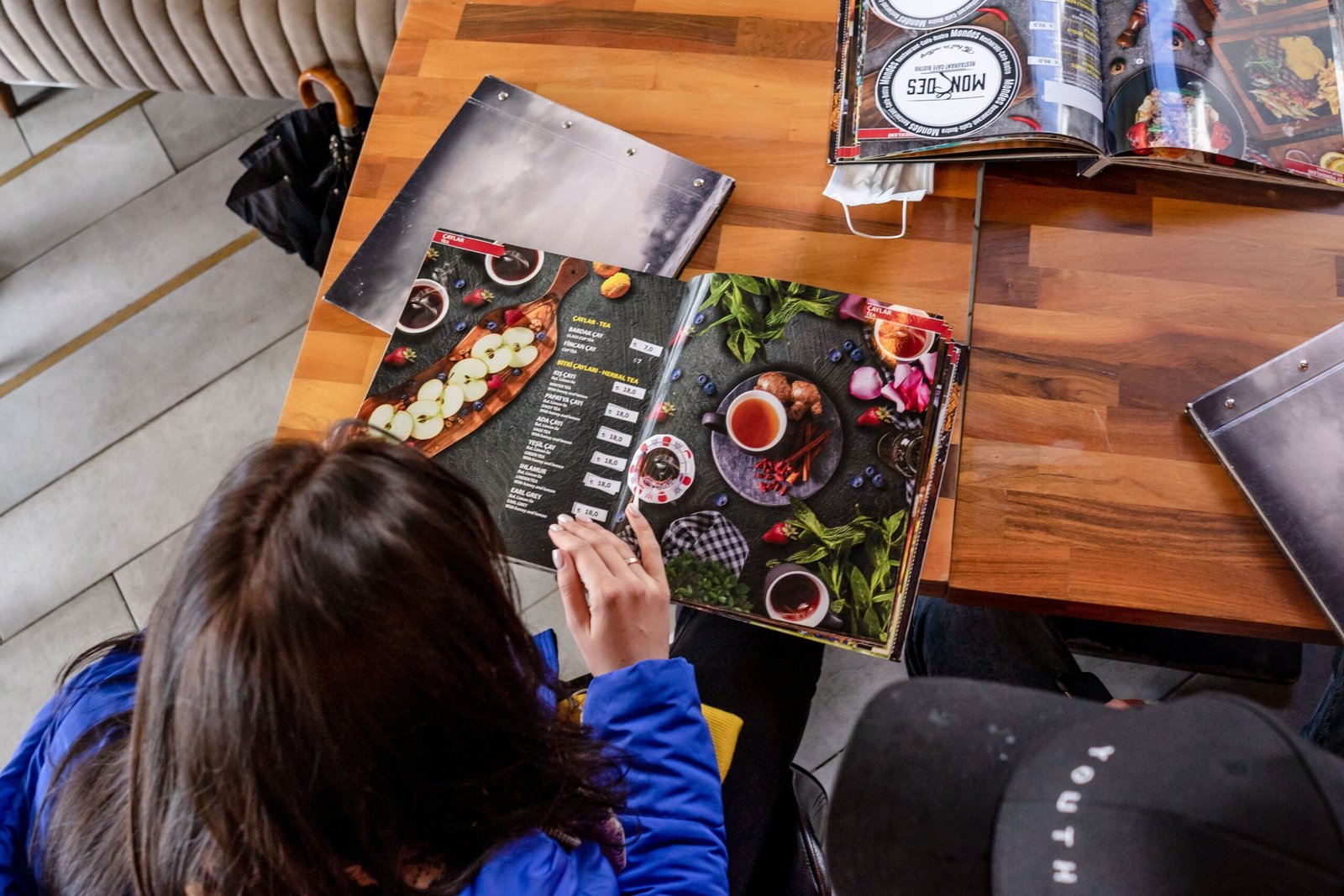
A two-page layout functions like an open book. Visual attention centers on the upper half of the right-hand page. It then traces a loop counter-clockwise toward the top left page before settling toward the bottom margins.
+-------------------+-------------------+
|     Position 2    |     Position 1    |
|    (Top Left)     |    (Top Right)    |
+-------------------+-------------------+
|     Position 4    |     Position 3    |
|   (Bottom Left)   |  (Bottom Right)   |
+-------------------+-------------------+
By prioritizing these specific zones for items with optimal production speeds and yield margins, a restaurant guides selection without verbal intervention from service staff.
Typography and Information Hierarchy
Font selection and arrangement directly govern the ease of information consumption. Confusion in text layout delays decisions, stalls table rotation speeds, and strains staff efficiency.
Sizing Ratios for Text
A clear division between headings, item names, and descriptions establishes a path for the eye to follow.
- Category Headings: 20-point to 24-point type size. This demarcates the start of a food classification.
- Item Titles: 12-point to 14-point type size. Bolding this line separates the dish name from surrounding data.
- Descriptions: 10-point to 11-point type size. Regular weight allows for continuous reading without strain under low lighting conditions.
Column Boundaries and Line Lengths
Line length must remain within fifty to sixty characters per line. Text lines that stretch too wide cause readers to lose their place when shifting their gaze back to the left edge. Keeping descriptions in structured blocks directly underneath the item title preserves horizontal space and prevents visual clutter.
Color Systems and Structural Contrast
Color alters item prominence and establishes boundaries across the surface area of a menu card.
Contrast Matrices for Low-Light Environments
Many food establishments operate under dimmed illumination to influence environment variables. High contrast ratios prevent text illegibility.
| Paper Tone | Font Color | Use Case |
| Cream / Off-White | Charcoal Black | Bistro, Dinner Service, Traditional Layouts |
| Matte Charcoal | Stark White | Modern Concepts, Night Venues |
| Light Kraft Paper | Dark Espresso Brown | Bakeries, Cafes, Quick-Service Units |
Strategic Isolation Through Color
Utilizing a single accent tone within a monochrome layout creates a focal point. Application of this accent to a single box or line of text draws the eyes to that sector immediately upon opening the document. Limiting this treatment to one item per section prevents sensory overload and maintains the isolation effect.
Item Volume and Choice Limitations
Overcrowding a menu document causes cognitive friction. When clients face excessive options, decision times lengthen, and satisfaction with the final selection decreases.
The Rule of Seven
Psychological research indicates that human short-term memory and selection models operate with peak efficiency when handling groups of seven or fewer elements.
[ Menu Category ]
   ├── Item 1 (High Margin)
   ├── Item 2
   ├── Item 3 (High Margin)
   ├── Item 4
   ├── Item 5
   ├── Item 6
   └── Item 7
Dividing large inventories into subdivisions ensures that no single list contains more than seven choices. For instance, instead of listing twenty entries under an “Entrees” heading, split the assets into “Poultry,” “Seafood,” and “House Specialties.”
Price Integration Mechanics
The presentation of item costs dictates whether a customer selects a meal based on flavor profiles or monetary constraints.
De-emphasizing the Cost Matrix
Aligning prices in a vertical column on the right margin with dots connecting them to the item name encourages comparison shopping. Guests scan down the row of numbers to locate the lowest figure.
Incorrect Column Format (Encourages price selection):
Item Name One ............................................. $18.00
Item Name Two ............................................. $14.00

Correct Inline Format (Encourages item description reading):
Item Name One  18
Item description containing ingredient and preparation details.
Integrating the price directly at the conclusion of the description block using the identical font weight and size removes the pricing column, forcing the eye to read the description before processing the cost.
Elimination of Currency Indicators
Removing currency signs reduces the psychological impact of spending. The number presented alone serves its functional purpose without constantly reminding the diner of financial transactions.
Descriptive Text Formulation
Menu descriptions must clarify composition, highlight key components, and define preparation techniques without resorting to fluff words.
Technical Precision in Ingredients
Detailing the exact components of a dish builds trust regarding dietary needs and allergies. State processing methods like roasting, smoking, or braising to convey texture and temperature preparation.
- Vague Description: House burger with cheese and sauce.
- Engineered Description: Beef brisket patty, sharp cheddar, fermented pickle, mustard emulsion, brioche bun.
The engineered text outlines specific components, clarifying value and flavor without using empty filler words.
Origin and Sourcing Disclosures
Specifying structural origins, local farm connections, or traditional preparation styles upgrades value retention. Naming specific regions or production methods grounds the dish in reality.
Physical Material and Presentation Dynamics
The weight, texture, and physical casing of a print menu transmit immediate messages regarding the establishment before any food arrives.
Paper Weight and Tactile Feedback
Lightweight paper that bends or stains easily communicates a lack of attention to detail. Utilizing stock weights between 80-pound cover and 120-pound cover ensures rigidity and durability during handling.
Paper Selection Criteria:
├── Fine Dining: High-gsm textured linen stock in leather or wood backing board.
├── Casual Bistro: Matte laminated heavy cover stock to resist liquid transfer.
├── Fast-Casual: Uncoated kraft paper sheets replaced daily.
Cover Configurations
Single-panel sheets work for high-rotation venues because they speed up decision-making. Multi-page books fit concepts centered on multi-course experiences, lengthening the time a customer spends exploring drink and dessert listings.
The Data Framework: Menu Engineering Matrix
Menu items undergo sorting according to historical point-of-sale information. This data groups dishes based on popularity (sales volume) and profitability (contribution margin).
                  HIGH POPULARITY
             +-----------------------+
             |         STARS         | PLOWHORSES
             | High Margin / Popular | Low Margin / Popular
             |                       |
             | Promotion: High       | Promotion: Low
             +-----------------------+
PROFITABILITY|        PUZZLES        | DOGS
             | High Margin / Unpop.  | Low Margin / Unpop.
             |                       |
             | Promotion: Alter Text | Promotion: Remove
             +-----------------------+
                   LOW POPULARITY
Action Plans for Each Quadrant
- Stars (High Profit, High Popularity): Position these in primary focal zones. Keep descriptions clean and unaltered.
- Plowhorses (Low Profit, High Popularity): Shift placement to lower-visibility areas or alter portion components to reduce food costs without reducing prices.
- Puzzles (High Profit, Low Popularity): Change the item name, rewrite the description text, or use visual borders to highlight its position on the page.
- Dogs (Low Profit, Low Popularity): Remove these options from the inventory to simplify kitchen prep and design space.
Layout Architecture for Specialized Menus
Separating secondary offerings into individual documents alters customer behavior and increases overall transaction totals.
Kids’ Segments
Keep younger demographics separated onto an independent sheet that includes interactive elements if appropriate for the concept. This design step ensures the adult menu retains its organizational structure and clean layout.
Dessert Strategies
Presenting desserts at the beginning of service causes guests to calculate total potential spending early, reducing entrée orders. Delivering a dedicated dessert menu after table clearance utilizes a clean slate model, encouraging spontaneous orders when defenses regarding spending are lower.
Beverage and Wine Categorization
Organize beverage sheets by flavor profiles rather than by price or geography. Grouping wines from lightest to heaviest body guides guests based on pairings rather than cost considerations.
Step-by-Step Layout Realization Sequence
Executing a redesign requires following an ordered series of operations to ground design choices in financial reality.
1.Data Extraction:Phase 1.
Pull sales velocity and product mix reports from the point-of-sale system tracking the previous ninety days of operation.
2.Financial Recipe Costing:Phase 2.
Calculate the exact cost of ingredients for every dish down to the ounce to identify exact contribution margins.
3.Item Classification:Phase 3.
Map items into the Engineering Matrix quadrants to isolate the Stars and identify the Dogs slated for deletion.
4.Grid Allocation:Phase 4.
Draft the physical layout grid, placing high-margin Stars into the eye-tracking sweet spots of the panels.
5.Typography and Text Application:Phase 5.
Apply type hierarchies, insert descriptions focusing on source materials, and remove currency indicators.
6.Physical Testing and Validation:Phase 6.
Print samples to review readability under actual dining area light levels before starting a full production print run.
Design Adjustments for Digital and QR Formats
Digital menus demand specific deviations from physical print standards because mobile screens alter reading habits.
Screen Adaptability and Responsive Reflows
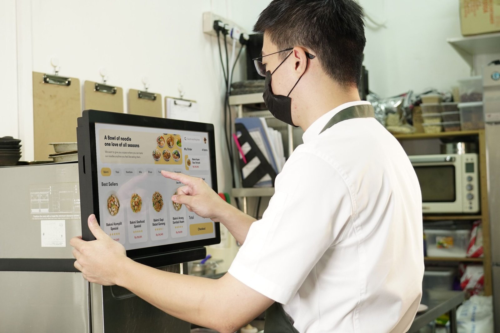
Using static PDF files on mobile devices forces users to pinch and zoom, leading to poor user experiences. Instead, use responsive web layouts that stack categories vertically for fluid scrolling.
Mobile Screen Framework:
+-----------------------------------+
|  [ Category Select: Tap to Jump ] |
+-----------------------------------+
|  [ Photo ]  Item Name  14         |
|             Description details   |
+-----------------------------------+
|  [ Photo ]  Item Name  16         |
|             Description details   |
+-----------------------------------+
Media Utilization Policies
While print menus benefit from clean text lines, digital layouts can accommodate strategic imagery. Use one photo per category section to establish visual anchors without cluttering smaller displays or slowing down page load times.
Regular Maintenance and Assessment Protocols
A menu requires continuous adjustment based on ingredient cost changes and changing consumer habits.
- Quarterly Cost Review: Audit ingredient costs every ninety days to ensure Plowhorses have not slipped into unprofitable territory.
- Seasonal Variant Schedules: Swap out low-volume items twice a year to leverage seasonal ingredient availability, keeping inventory costs down.
- Wear and Tear Checks: Inspect physical menus daily before shifts start. Discard documents showing bent corners, water spots, or frayed edges to protect your brand image.
Structuring a menu layout around clear visual systems, accurate data engineering, and readable typography removes friction from the ordering process. This systematic design model optimizes the customer experience while steering selection choices toward maximum business profitability.