
A restaurant menu serves as a precise engineering layout that guides human behavior and controls purchasing decisions. Minor errors in formatting, item placement, and pricing mechanics quietly erode revenue margins, slow down table rotation, and strain kitchen operations.
Removing these common structural oversights prevents revenue loss and improves customer satisfaction.
1. The Price Alignment Trap
Setting prices in a uniform vertical column along the right-hand margin connected by dot leaders is a primary cause of low transaction averages.
Incorrect Column Format (Encourages price selection):
Pan-Seared Salmon .......................................... $26
Grilled Pork Chop .......................................... $22
House Chicken Sandwich ..................................... $14

Correct Nested Format (Encourages item consideration):
Pan-Seared Salmon  26
Wild rice blend, seasonal greens, lemon butter emulsion.

Grilled Pork Chop  22
Roasted root vegetables, apple cider reduction.
When prices line up in a neat column, customer eyes scan down the numbers to locate the lowest figure rather than reading the food descriptions. Placing the price directly at the end of the item description using the same font weight forces the eye to read the preparation details before processing the cost.
2. Currency Indicator Friction
Including currency symbols like dollar signs ($) next to price points triggers visual reminders of financial loss.
- Flawed Design: $18.00
- Engineered Design: 18
Research into consumer habits reveals that removing currency symbols increases overall table spending. The standalone number delivers functional information without triggering the psychological resistance associated with spending money.
3. Excessive Item Density and Choice Overload
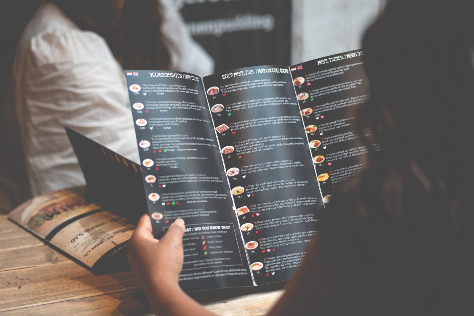
Listing dozens of dishes under a single heading causes visual fatigue and decision paralysis.
Choice Paralysis Model:
[ 15+ Pasta Choices ] ──> Customer Overwhelm ──> Long Decision Times ──> Safe/Cheapest Choice Selected

Streamlined Category Model:
[ 5-7 Selected Pastas ] ──> Fast Evaluation ──> Efficient Ordering ──> Higher Satisfaction
When customers face too many choices, decision times increase, slowing down table rotation during busy service hours. Limit categories to a maximum of seven items. If a section contains fifteen options, divide it into specific sub-categories like “Handmade Pasta” and “Oven Bakes.”
4. Visual Clutter and Excessive Formatting
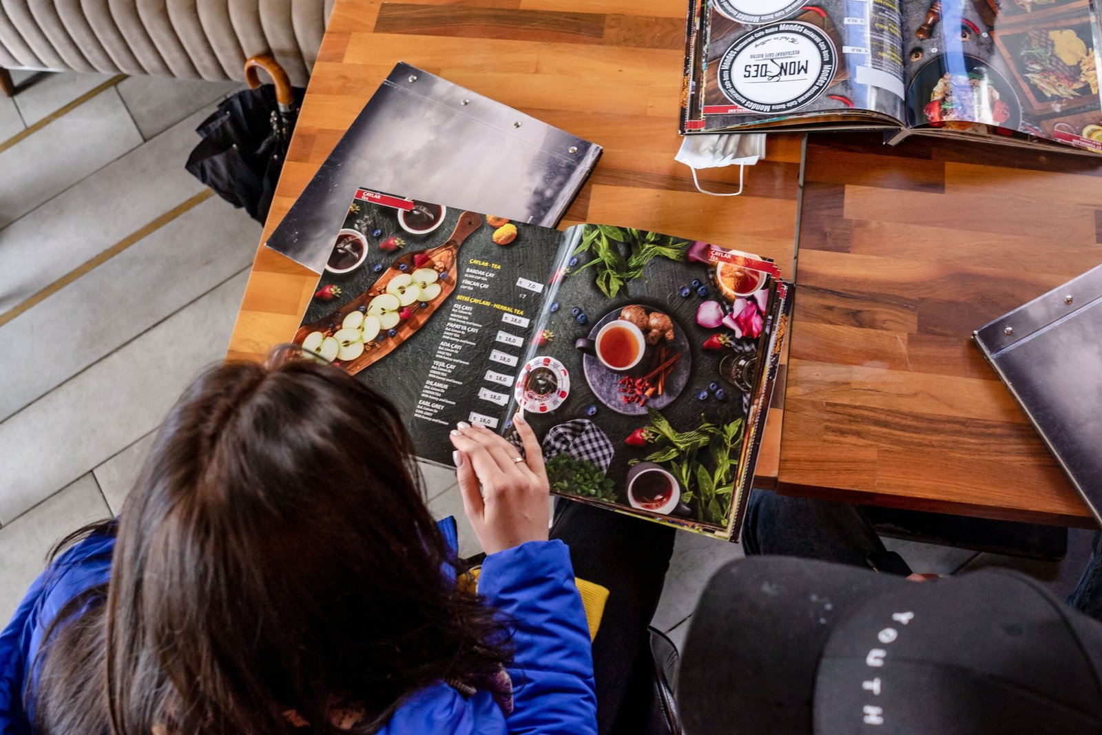
Attempting to highlight every item using bright colors, icons, bold text, or photos creates visual confusion, making nothing stand out.
Visual Hierarchy Rules:
├── Page Background: Uncluttered, high contrast relative to text.
├── Primary Highlights: Maximum 1 item boxed or shaded per panel.
├── Color Accent Count: Limit to 1 secondary tone for category titles.
└── Photos: Restrict to digital interfaces or keep to 1 per page max in print.
When multiple boxes, starburst badges, and photos compete for attention on a single sheet, the customer eye skips over the high-margin items altogether. Restrict graphic elements to one primary highlight per page panel.
5. Poor Menu Engineering Allocation
Placing signature, high-margin dishes in visual dead zones wastes high-value page space.
Two-Panel Eye-Tracking Sweet Spots:
+-------------------+-------------------+
|     Position 2    |     Position 1    |  <-- Place High-Profit Items Here
|   (Secondary Focus)|  (Primary Focus)  |
+-------------------+-------------------+
|     Position 4    |     Position 3    |
|   (Lowest Focus)  |  (Moderate Focus) |
+-------------------+-------------------+
Eyes follow predictable scanning paths across paper sheets. On a two-page layout, visual attention focuses first on the top right quadrant of the right-hand page. Placing low-margin or labor-intensive dishes in these high-visibility areas reduces overall profitability.
6. Vague and Uninformative Descriptions
Descriptions that rely on generic adjectives rather than listing actual ingredients fail to build perceived value.
- Vague Copy: Our delicious house-made signature burger with tasty sauce and fresh toppings.
- Informative Copy: Ground brisket patty, aged sharp cheddar, fermented pickle, house mustard emulsion, brioche bun.
Generic words like “delicious,” “gourmet,” or “fantastic” take up space without explaining what makes the dish special. Detailing exact ingredients, cooking methods (braised, smoked, seared), and farm origins clarifies quality and justifies higher prices.
7. Ignoring Digital Screen Constraints
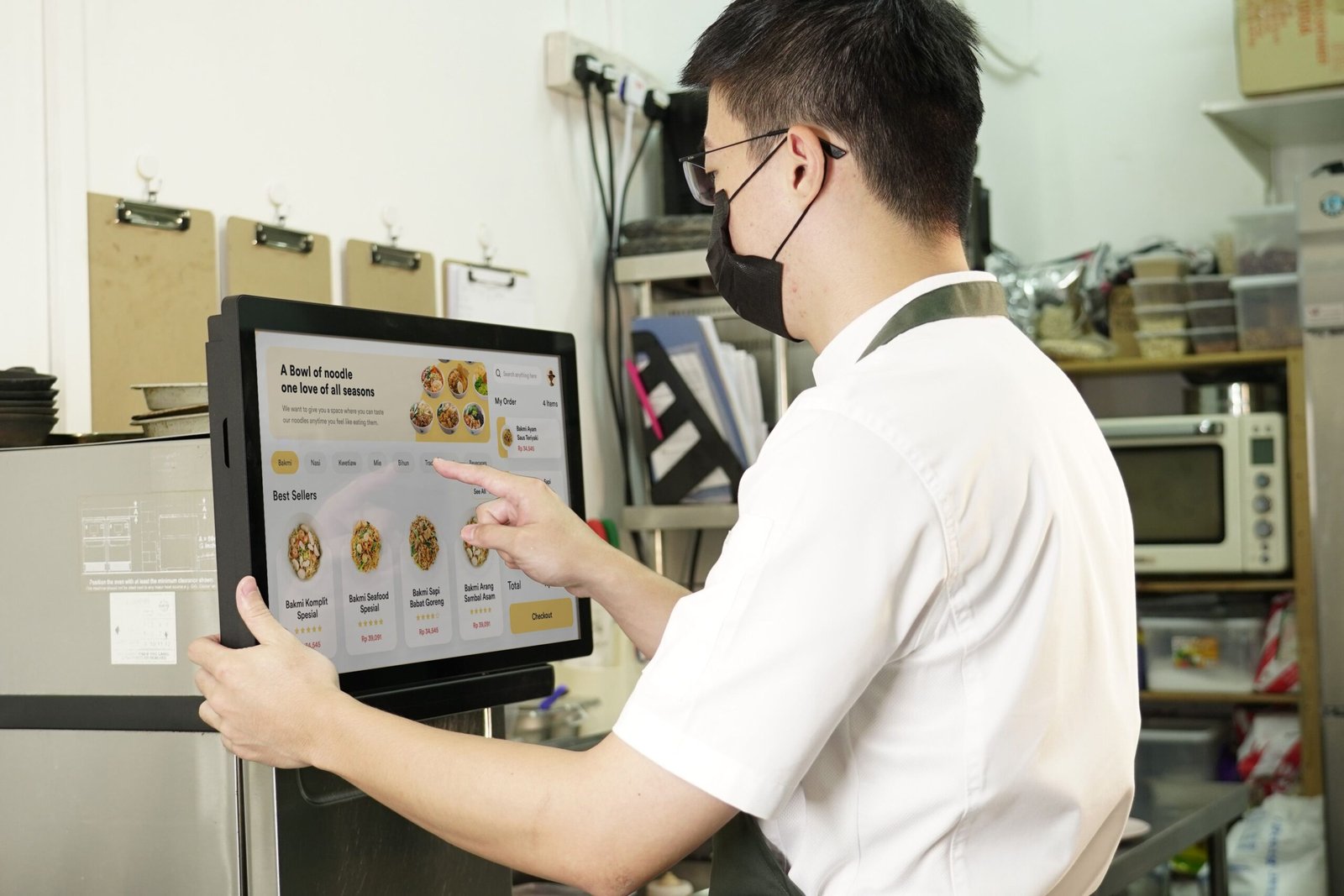
Uploading a static PDF copy of a multi-panel print menu to a digital platform or QR system creates significant user friction on mobile devices.
Mobile Screen Compatibility Matrix:
├── Static Print PDF: Requires pinching and zooming ──> High exit rates, frustrating UX
└── Responsive Mobile Menu: Stacks categories vertically ──> Fast navigation, clear visual cards
Mobile users must zoom in and pan around static PDFs to read tiny text. Digital food menus require clean, responsive web layouts with vertical scrolling, simple tap controls, and sticky navigation headers to ensure quick browsing on small screens.
Audit and Correction Sequence
Use this step-by-step checklist to review and update your menu layout.
1.Audit POS Sales Data:Step 1.
Identify your high-profit, high-volume items (Stars) versus your low-profit, low-volume items (Dogs).
2.Eliminate Currency Signs:Step 2.
Remove currency symbols across all print sheets and digital interfaces.
3.Break Up Pricing Columns:Step 3.
Nest price values directly at the end of the item text blocks to prevent price-shopping down margins.
4.Trim Item Counts:Step 4.
Cap section counts at seven options per category to speed up decisions and clear kitchen bottlenecks.
5.Relocate High-Margin Items:Step 5.
Position high-profit Star items in the top right quadrant of two-panel spreads or the upper third of single sheets.
Fixing these formatting mistakes transforms your menu into a clean, easy-to-read ordering system. Removing friction from the decision-making process helps guide customers toward your best dishes while steadily increasing average table sales.