Small restaurants operate under distinct spatial and operational constraints. Unlike large commercial kitchens with vast storage capacities, small venues must manage tight prep lines, limited inventory space, and rapid table turnover goals. The physical menu layout serves as an operational tool to enforce these constraints while maximizing table spend.
The Strategic Power of Limitation: Single-Page vs. Two-Panel
Every square inch of a menu panel dictates operational speed. Small restaurants must select a configuration that matches their production capacity.
The Single-Page Canvas (The Agile Model)
A single-panel menu fits focused concepts like pizzerias, burger rooms, ramen shops, and modern bistros.
+---------------------------------------+
|             BRAND HEADER              |
+---------------------------------------+
|  [ CATEGORY 1 ]     |  [ CATEGORY 2 ] |
|  Item A ........ 14 |  Item D ........ 16 |
|  Item B ........ 15 |  Item E ........ 18 |
|  Item C ........ 12 |  Item F ........ 15 |
+---------------------------------------+
|            [ HOUSE SPECIALS ]         |
|  * Item G (High-Margin Star) ...... 24 |
+---------------------------------------+
- Operational Benefit: Forces the kitchen to limit inventory, which minimizes waste and speeds up preparation.
- Customer Impact: Reduces decision paralysis, leading to faster ordering cycles and shorter table turn times.
- Placement Strategy: Place high-margin items in the center-top sector or isolate them within a single box in the lower third.
The Two-Panel Spread (The Structured Model)
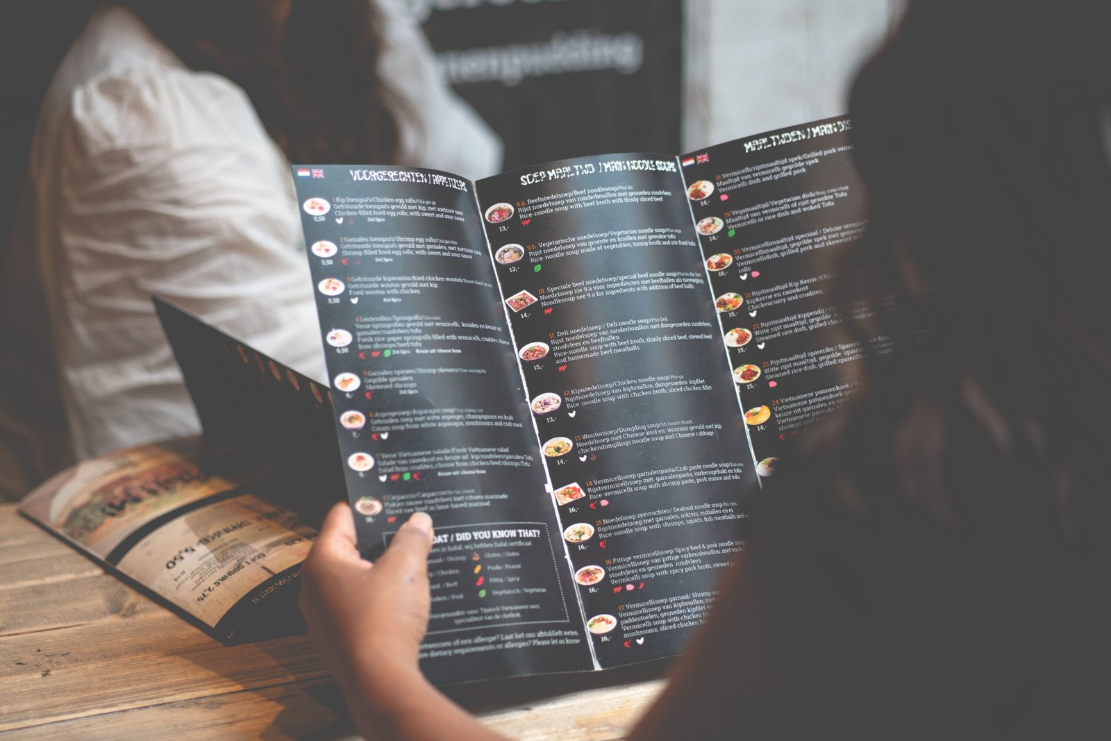
A two-panel layout reads like an open booklet, providing enough space for multi-course operations without crowding the page.
+-------------------+-------------------+
|                   |    HIGH MARGIN    |
|   APPETIZERS      |    ENTRÉES        |
|   & SALADS        |    (Primary Focus)|
|                   |                   |
+-------------------+-------------------+
|   SIDES &         |    DESSERTS &     |
|   BEVERAGES       |    ADD-ONS        |
+-------------------+-------------------+
- Eye Movement Dynamics: The eye starts at the top right panel before moving to the top left. Place high-profit entrees at the top right.
- Layout Rule: Avoid expanding beyond two panels. Adding inserts or extra pages dilutes the focus, drifting attention away from core profit items.
Grid Architecture and Spatial Allocation
How elements sit on the page determines what customers read first. Proper grid alignment stops pages from looking messy and hard to read.
Column Systems vs. Stacked Formats
Using side-by-side columns works well for short item listings like drinks or simple tacos. However, detailed descriptions need a stacked layout to stay readable.
Two-Column Grid (Short Titles Only):
Appetizers            Salads
Fries ........... 6   House .......... 9
Wings .......... 12   Caesar ........ 11

Stacked Grid (For Detailed Descriptions):
House Smoked Brisket Sandwich  16
Texas toast, pickled red onions, house barbecue glaze.
White Space Ratios
Keep at least 30% to 40% of the menu sheet blank. Cramming text to the edges tires the eyes and makes guests feel rushed. White space surrounding an item acts like a spotlight, giving the dish a premium look.
Categorization Frameworks that Optimize Kitchen Flow
Small restaurant kitchens break down when orders hit one station too hard while others sit idle. Grouping your menu smart can balance the kitchen’s workload.
The Rule of Seven Maximums
Limit categories to a maximum of seven sections, with no more than seven items per section.
Kitchen Station Balance Model:
├── Griddle Station: Max 4 items
├── Fryer Station:   Max 3 items
├── Prep/Salad Line: Max 4 items
└── Assembly Station: Final integration
Structuring item counts around station capacity prevents bottlenecks during peak dinner rushes.
Section Order Layout
Organize listings by course progression: starters, mains, sides, then drinks. However, if a specific low-labor appetizer carries an excellent profit margin, place it at the absolute top of the first category to drive high volume.
Price Integration without Friction
Small venues rely heavily on per-seat averages to meet fixed rent costs. The price layout should guide selections based on ingredients, not cost comparison.
Drop the Currency Symbols
Remove all currency signs like “$” from the layout sheet. Use simple numerals set two spaces after the item title or description text.
- Incorrect: Ribeye Steak ………………. $34.00
- Correct: Ribeye Steak 34
The Nested Price Method
Do not let prices line up in a neat vertical column down the right side of the page. This layout pattern encourages customers to scan for the lowest number. Instead, nest the price number at the end of the dish description using the same font style.
Nested Layout Example:
Pan-Seared Salmon Wild rice, seasonal greens, lemon butter sauce. 26
Material and Typographic Specifications
Physical design assets must match the practical needs of small dining rooms.
| Element | Specification | Practical Purpose |
| Font Count | Maximum 2 Font Families | Maintains clean styling; prevents visual mess. |
| Title Size | 12-point to 14-point Bold | Grabs attention instantly during scanning. |
| Body Size | 10-point Regular | Remains easy to read in soft dining room light. |
| Paper Weight | 80-pound to 100-pound Cover | Feels sturdy; resists folding and wear. |
Clipboard and Board Mounts
For menus that change daily or weekly based on market availability, use a wood backing board or a heavy clipboard. This system lets you print fresh sheets on standard office paper in-house, keeping the presentation sharp while eliminating printing company costs.
Menu Engineering Matrix Application
Review your sales data every month to sort your dishes into four operational performance quadrants.
                  HIGH POPULARITY
             +-----------------------+
             |         STARS         | PLOWHORSES
             | High Margin / Popular | Low Margin / Popular
             |                       |
             | Action: Highlight     | Action: Adjust Recipe
             +-----------------------+
PROFITABILITY|        PUZZLES        | DOGS
             | High Margin / Unpop.  | Low Margin / Unpop.
             |                       |
             | Action: Re-describe   | Action: Remove
             +-----------------------+
                   LOW POPULARITY
Execution Tactics for Small Layouts
- Stars: Keep them in high-visibility zones like the top right corner. Use a subtle box border to draw focus.
- Plowhorses: Move them down the page layout. They sell well naturally, so they do not need prime visual real estate.
- Puzzles: Rewrite their descriptions with clearer ingredient details, or change their spot on the menu grid.
- Dogs: Remove them immediately. They take up space on the page and in your walk-in cooler.
Implementation Sequence
Follow these steps to update and deploy your new menu layout.
1.Calculate Ingredient Costs:Phase 1.
Find the exact cost of ingredients for every dish to figure out your true margins.
2.Sort by Sales Volume:Phase 2.
Run point-of-sale reports from the last 90 days to find your Stars, Plowhorses, Puzzles, and Dogs.
3.Select the Panel Layout:Phase 3.
Choose either a single-page format or a two-panel spread based on how many items you have.
4.Map Items to Focal Points:Phase 4.
Place high-margin Stars in the primary eye-tracking spots on the page.
5.Apply Typography Rules:Phase 5.
Set clear font sizes, nest your prices, and remove all currency symbols.
6.Test Under Dining Lights:Phase 6.
Print a test copy and check readability inside your dining room during service hours before printing the full batch.
Using a clean grid, limiting your options, and hiding price columns lets a small restaurant take control of its sales path. This layout setup improves the customer experience while pointing diners toward the kitchen’s most profitable dishes.